
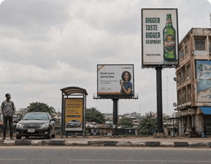
When planning an out-of-home campaign, the immediate temptation is to secure the largest, most towering board visible. We naturally equate size with impact. But in Nigeria's crowded outdoor landscape, scale alone is a vanity metric.
A massive gantry that stretches over an expressway is useless if the speeding commuter only has 1.5 seconds to process it. Conversely, a modest street-level bus shelter panel in a high-footfall area can generate deep engagement because of prolonged dwell times. Selecting the right size is about working backward from target behavior.
Why billboard size matters
Size dictates more than just the cost of media space. It directly impacts font legibility, the complexity of visual assets, production turnaround times, and regulatory municipal fees. A mismatch between physical size and environmental placement leads to wasted spend.
Are billboard dimensions standard in Nigeria?
In Nigeria, standard terms like "48-sheet" or "96-sheet" are frequently used, but they do not guarantee uniform physical dimensions across all operators. Municipal structural differences mean you must verify the precise blueprint of every approved site.
Key specifications to confirm before design:
Exact physical width and height measurements
Preferred local unit of measurement (meters or feet)
Structural orientation (portrait vs landscape)
Visible display area vs structural borders
Required bleed margins and text safe zones
Required print or pixel dimensions
Accepted digital file formats and resolution settings
Local state environmental guidelines (e.g. LASAA in Lagos)
Common size categories in Nigeria
Small-format outdoor displays
These include lamp-post panels, bus shelters, and pedestrian walkways. Positioned at eye level, they offer extended viewing times for commuters walking or waiting in traffic.
Standard roadside boards
The traditional landscape and portrait formats found along key arterial roads and secondary urban junctions. Highly versatile and cost-effective for general awareness.
Large-format boards
Overhead gantries, high-rise unipoles, and giant digital LED screens. Built for long-distance visibility on major expressways but require extreme message simplicity.
Building wraps and wallscapes
The building facade itself becomes the creative medium. Outstanding branding impact that transforms urban landmarks into iconic marketing statements.
Size and viewing distance
The farther away your target audience is, the larger your primary design elements must be. A small logo on an enormous unipole will completely disappear from 150 meters away. You must scale key text elements proportionally to match the environment's sightlines.
Size and traffic speed
High-speed expressways (like the Third Mainland Bridge or Outer Marina) demand quick recognition. A fast-moving audience requires fewer words, larger font weights, and high chromatic contrast. Save detailed explanations for low-speed bottleneck intersections.
Size and orientation
Landscape orientations are naturally read left-to-right, making them perfect for horizontal copy blocks. Portrait orientations are ideal for powerful vertical character portraits, tall packaging shots, and simplified stacked typography.
Size and message complexity
A larger billboard provides more physical square footage, but **never** more viewing time. Commuters will not spend more time reading a giant board. Keep your layout disciplined by answering only four core structural questions:
What is this? (One clear, bold benefit statement)
Why should I care? (An emotional or functional hook)
Which brand is speaking? (Unmistakable logo placement)
Is there one next step I can easily remember? (A brief, direct call to action)
The arm's-length and thumbnail tests
Before committing to expensive print files, perform the thumbnail test. Shrink your digital layout down to the size of a business card. Hold it at arm's length. If you cannot easily read the headline or instantly identify the brand logo in under three seconds, your design will fail on the road.
Large board, small logo?
Many brands make the error of scaling their logo to cover 50% of the display. An oversized logo ruins design balance and looks desperate. Your logo only needs to be large enough to remain legible at the maximum viewing distance. Focus on a strong benefit visual instead.
Questions to ask before approving a billboard size
What are the exact pixel or print dimensions required?
Is the board orientation landscape or portrait?
From which direction does the traffic approach the board?
What is the average environmental visibility distance?
What is the average traffic speed on this route?
Does the flow of traffic change significantly throughout the day?
What kind of illumination will the billboard use at night?
Are there any trees, buildings, or other structures blocking the view?
Does our creative concept fit this physical shape naturally?
Can the headline and brand be fully understood in three seconds?
Is the raw digital file built to the exact operator specs?
Final thought
Choosing the right billboard size is a strategic decision. By working backward from target audience locations, route speeds, and message complexity, you can avoid costly vanity placements.
Keep Reading
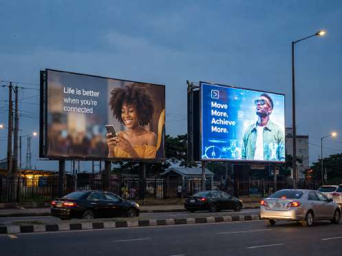
Static vs Digital Billboards: Which One Will Work Harder for Your Campaign?
The static vs digital decision should come down to what the campaign needs, not which format looks more modern in a presentation.
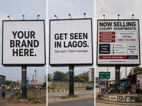
How to Write Billboard Copy People Remember After Five Seconds
Impressions are not outcomes. A practical framework for structuring awareness, consideration and conversion spend so the board sees naira, not vanity metrics.
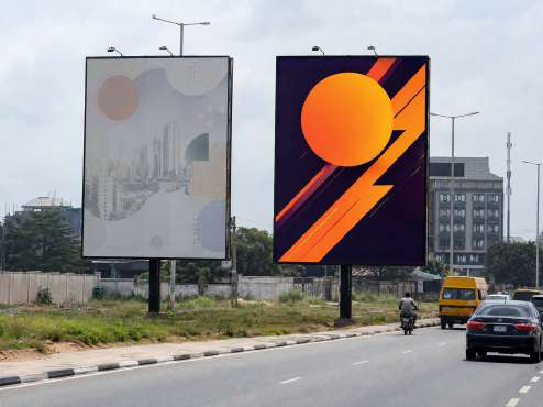
Billboard Design Tips: Make Your Idea Survive the Nigerian Road
A beautifully produced ad for a brand nobody can describe is expensive wallpaper. Sharpen the sentence before you increase the budget.