
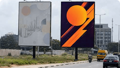
A billboard can look brilliant on a designer's screen and disappear completely once it reaches the road.
The problem is rarely taste. It is context. The artwork may have been approved close-up on a bright monitor, while the audience sees it from a moving vehicle, through rain or harmattan haze, at an angle and beside dozens of competing signs.
The best billboard design tips begin with one rule: design for the conditions in which people will actually see the work.
Design for a few seconds
Most roadside audiences do not study billboards. They glance at them.
The design must make four things clear quickly:
The main idea
The dominant visual
The brand
The next step, where one is needed
Show the artwork to someone for five seconds, hide it and ask what they remember. When they recall a background detail but miss the brand or message, the visual hierarchy is wrong.
Five seconds will reveal more than twenty minutes of explaining the concept in a meeting.
Use one visual centre
Every billboard needs one clear place for the eye to land.
That centre might be a product, face, headline, familiar object or unusual visual idea. What matters is that one element leads.
Problems begin when the product packs, logo, price, headline, badge, photograph and call to action all demand equal attention. The audience does not know where to look first, so nothing lands properly.
Choose the hero. Let everything else support it.
Make the idea simple, not empty
Simple design does not mean placing a tiny logo on an empty background and calling it premium.
It means making the idea easy to find.
A simple billboard can still be funny, emotional, colourful, dramatic or strange. It can be loud or minimal. The creative can have personality without becoming difficult to understand.
The real test is whether people can grasp the intended point without hearing the strategy presentation.
Complex thinking can produce simple work. Confused thinking usually produces crowded work.
Use strong contrast
Contrast helps a billboard survive distance, sunlight, weather and movement.
Check the relationship between:
The headline and background
The product and surrounding image
The logo and its placement
Brand colours viewed in daylight
The daytime and night-time versions
Different colours can still have similar brightness levels and blend into each other from a distance. A pale yellow headline on a white background may look stylish on a laptop and vanish under Lagos sunlight.
Convert the design to greyscale as a quick test. When the main message disappears, the value contrast is probably too weak.
Choose readable type
Billboard typography should be recognised quickly, not admired slowly.
Use large type, clear letterforms, strong weight and enough spacing between letters and lines. Keep the number of fonts limited.
Be careful with:
Thin typefaces
Decorative scripts
Overly condensed fonts
Long sections in capital letters
Tight line spacing
Text placed over busy photographs
Outlines with weak contrast
A brand font can still be used, but the road gets the final vote. When the typeface becomes difficult to read at the required size, brand consistency has started working against communication.
Keep the text block compact
A headline stretched from one end of a wide billboard to the other forces the eye to travel too far.
A compact text block is usually faster to process. Break lines according to meaning, not wherever the design software runs out of space.
For example:
MOVE MONEY
BEFORE TRAFFIC MOVES
This is easier to scan than the same words spread across one long horizontal line.
Line breaks can also control rhythm and make the most important phrase land first. Just avoid breaking sentences in places that make them awkward to read.
Use images that work at scale
Billboard images need to remain clear from a distance.
Strong options include one large product, one expressive face, a simple silhouette or a familiar object used in an unexpected way.
Busy lifestyle scenes often lose meaning on the road. So do collages, rows of tiny product variants and generic stock photographs with no connection to the idea.
Zoom out until the artwork is small. When the subject becomes unclear, crop tighter or simplify the image.
The billboard does not need more objects. It needs one image people can recognise before they pass it.
Make the brand visible
A memorable billboard that leaves people unsure about the advertiser has done free work for the category.
The logo needs enough size, clear space and contrast to remain visible from the road. Do not place a dark mark over a dark photograph and assume people will search for it.
Brand visibility may also come through packaging, colour, type and tone. Familiar brands can sometimes rely on these assets more heavily, but newer brands need to be more direct.
The logo does not have to dominate the design. It simply cannot disappear.
Test it from a realistic distance. What looks oversized in the design file may be exactly right on the installed board.
Use the structure as part of the idea
A billboard is a physical object, not only a rectangular image.
Creative can use:
Extensions beyond the frame
Product cut-outs
The supporting pole
A wall or building
The sky behind the board
A sequence of panels
Traffic direction
A nearby landmark
A cracked visual can appear to break through the frame. A product can hang outside the board. Several lamp-post panels can reveal a message one part at a time.
The effect must still be safe, producible and approved. An impressive mock-up that cannot survive installation is not a finished idea.
Design for the exact format
Do not create one billboard layout and resize it across every outdoor format.
A gantry, portrait board, digital screen, wall drape and bus-shelter panel have different proportions, viewing distances and audience behaviour.
The campaign thought should remain consistent, but the execution must adapt.
A wide gantry may need a short horizontal headline. A portrait board may suit one tall product image. A street-level panel can sometimes carry slightly more information because the audience is closer.
Resizing is not adaptation. When the important elements become smaller, cramped or badly positioned, the artwork needs to be rebuilt.
For help selecting the right shape before designing, read about the types of billboards in Nigeria.
Design for static billboards
For static billboard design:
Confirm the final dimensions, bleed and safe area
Use high-quality source images
Check print colour expectations
Account for seams, frames and obstructions
Avoid small text
Plan for night lighting
Review a scaled proof
Inspect the final installation
Static formats can support cut-outs, extensions and other physical effects. But the core message should still work without the production trick.
Print also behaves differently from a bright screen. Colours may appear flatter, and low-resolution images become much harder to hide at billboard scale.
Design for digital billboards
For digital billboard design:
Use the exact pixel dimensions
Work with the required colour settings
Check brightness and contrast
Keep movement simple
Avoid rapid flashing
Make every frame understandable
Keep the brand visible
Confirm the display duration
Test on the actual screen where possible
A digital billboard is not a television advert placed beside the road.
People may only see one frame, so the message should not depend on watching the full sequence. Do not hide the product or brand until the final second.
White backgrounds can also look harsh or washed out on some LED screens. Test the creative under the site’s real daytime and night-time conditions.
Think about the Nigerian environment
Billboard design in Nigeria competes with dense signage, traffic, bright sunlight, market activity, streetlights, informal banners and other advertisements.
Weather matters too. Rain can reduce visibility. Harmattan haze can soften detail. Power interruptions may affect lighting or digital displays.
That does not mean every design should become louder.
In a crowded environment, a clean board with one confident line may attract more attention than another colourful composition shouting for space.
Inspect the exact location before finalising the visual approach. A background colour that works against the sky may disappear against the building behind another board.
The environment should influence the design, not surprise the team after installation.
Be careful with QR codes and small details
QR codes can work where people are walking, waiting or sitting in slow traffic. They should not be the only response route on a fast road.
Where a QR code is included:
Make it large enough
Use strong contrast
Leave clear space around it
Test it from the intended distance
Provide a memorable alternative
Do not encourage unsafe behaviour
Legal lines and disclaimers should also be considered early. When required information cannot be made readable, the message or format may need to change.
Shrinking compulsory text until nobody can read it is not a design solution.
Build a real-world mock-up
Place the artwork into a photograph of the exact site or a realistic representation of it.
Then view it:
Full screen
Small on screen
In greyscale
From a distance
For five seconds
In day and night conditions
Beside surrounding colours
On a phone
A mock-up should expose problems. It should not hide them behind a dramatic camera angle or make the board look larger than it will appear from the road.
Use photographs taken from the audience’s actual approach direction. That is where the design has to work.
Inspect after installation
The live board is the final design.
Check whether the print is aligned, the seams are acceptable and the material is properly installed. For digital screens, confirm that the file is sharp and playing for the agreed duration.
Also check:
Is the board properly lit?
Is anything blocking it?
Does the colour match the approved proof?
Is the logo visible from the road?
Is the correct creative displayed?
Has the surrounding environment changed?
Take photographs from the audience’s approach, not only from directly in front of the structure.
A campaign is not complete because the installation team sent one flattering picture.
A billboard-design checklist
Before releasing the artwork, confirm:
One clear visual centre
One main message
Strong contrast
Readable typography
Visible brand identification
Minimal clutter
A format-specific layout
Correct dimensions
Suitable production files
Day and night visibility
A realistic response mechanism
Required approvals
A five-second recall test
A site-specific mock-up
A post-installation check
When several answers are uncertain, the headline is not ready.
Final thought
Good billboard design tips are not about adding more polish to an overcrowded layout. They are about protecting the main idea from everything that can weaken it on the road.
Design for movement, distance, light, clutter and the exact structure. Make the thought easy to find and the brand easy to identify.
For the words carrying the visual idea, read how to write billboard copy.
Before your artwork leaves the screen and enters the city, let Xpark360's billboard advertising service test whether it can survive the road.
Keep Reading
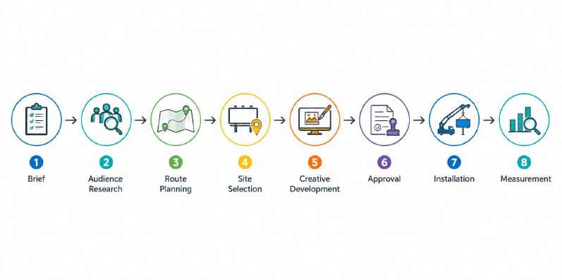
How to Plan a Billboard Campaign From Brief to Measurable Results
A media owner sends over a list of vacant boards. The smarter response is to pause and plan from the business problem first.
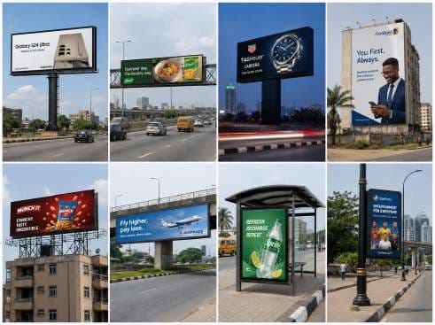
Types of Billboards in Nigeria: What to Use, Where and Why
The different types of billboards in Nigeria are built for different viewing conditions. The right format gives your message the best chance of being noticed.
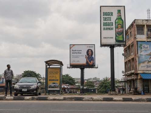
Billboard Sizes in Nigeria: Why Bigger Is Not Always Better
Billboard sizes in Nigeria should never be judged by scale alone. The useful question is which size gives this message the best chance of being noticed.